Wow! My fourth week doing this. Awesome! This week the word is Forward.
Okay, so after a lot of browsing and geeking with fellow art enthusiasts, I came across an artist named Pete Hawley. His style is very expressive, with amazing gestures and a variety of different styles, from Pin Ups to Cartoons.
This ad for Cocacola really caught my eye, and not just because it's my favorite pop.
Okay maybe it helped. Regardless! She's rendered in a way with no harsh outlines; just soft blending of colours. In terms of Graphic Design, this could be left as a filled in silhouette and it would still look fantastic.
I went through a lot of brain storming, idea exploring and doodling before coming to a theme I was sure would be best for this week.
At first I was thinking maybe a story about 'moving forward', and while it was nice and thoughtful, I ended up thinking of a modern idea that really had me excited; send it forward! A story about email obsessed recluses!
Are you excited? I certainly am! On to the rough work!
In order to find the most effective layout, I experimented with a bunch of different poses in different places on the "cover".
I chose a layout I felt would best represent my theme, and began to paint in Photoshop. The boy is being painted in cool tones, to give him a mysterious feel even though he's the one we are seeing most of. The girl is being painted with warm colours, and less detail. I want her to be alluring despite seeing less of her expression than the boy.
with everything coloured, I started working out the kinks of the entire composition and created a title in Illustrator to place inside the file. I also went in and added a high light or two into the laptop and faces of the two characters in the color of their counterpart's color scheme.
Voila! My fourth Illustration Friday is complete.
Saturday 28 January 2012
Friday 27 January 2012
Cat Troubles
I'm allergic to cats. Love them, but they make me sneeze and my throat itch. That being said, my landlord has a cat, and for some reason, ALWAYS tries to get into my apartment/bedroom. Like some kind of mission in his life. Sometimes he sneaks in when my door is open while talking to the landlord and just makes himself comfortable under my bed.
Well, I was doing my laundry, and lo and behold, kitty wonder tries to shmooze his way in again.
I wasn't buying his act!
I am starting to think he doesn't respect my authority...
Well, I was doing my laundry, and lo and behold, kitty wonder tries to shmooze his way in again.
I wasn't buying his act!
I am starting to think he doesn't respect my authority...
Tuesday 24 January 2012
Shameless Pluggin'
This is a blog I've been following for a while that I really adore. He tells stories and draws cartoon illustrations for them. It's witty, silly and always makes me smile.
Books of Adam
Books of Adam
Monday 23 January 2012
Illustration Week 3 - Twirl
Alright! Another week gone by. This time the word is Twirl. I immediately had a million ideas for this, and after some thought, I decided on a fantasy theme involving dragons. They`re so fun to draw because of all the little details they can have.
I started off by looking up lot`s of different illustrations of dragons on Google searches, as well as sites like conceptart.org. I also looked at the art of some artists from the early days for good composition, but also successful uses of color. I want this piece to be full of depth and radiant colours.
While nibbling on chicken wings, I flipped through some flickr sets and found the work of Bruce Bomberger. Not only is his name epic, so is his artwork.
This is predominately blue with yellow, but it has a variety of values, giving it a lot of depth. There is fantastic visual contrast using lighting, and it really caught my eye. I hope to achieve something like this in my next work.
I really enjoyed the thumbnail process for this, and it didn't take me very long. I plan to do some more to map out the two characters I plan to use in the final piece; A dancer and a dragon.
As I drew the dragon and girl over and over to evolve their appearance, I also tried to think about what sort of setting I wanted them to suit. I settled on a water based setting, and designed my dragon to be a leviathan. The girl I wanted to appear wild, but still graceful since she is a dancer. I gave her a fur headdress with a jeweled crown, and made the headdress large and wild. I tried to include face paint thinking it would accent the wild side but it didn't work too well, so that was scrapped right away.
The outfit was modeled after belly dancers, because it's lovely, fluid and detailed but doesn't clash with the headdress.
Now to dive into Photoshop!
Thursday 19 January 2012
Illustration Friday - Prepare
Time for my second week of Illustration Friday!
After browsing through some flickr sets, I stumbled upon this gem by Lou Cunette:
I love the kind of split screen thing happening here. Two woman from different eras exchanging a gift, as if they were right there beside each other in the same room. I'm hoping to achieve a similar composition in my work this round.
The lady in blue inspired me to try a period piece, with fashion inspired by the 1800s.
I went on a tangent with my thumbnails, mostly to keep the pencil going and explore ideas. I ended up designing a man and woman that I am growing attached to in the second picture down below.
Now that I have their faces, it's time to design some clothes! Glorious clothing!
So after a lot of searching for early, mid and late 1800s fashion, I decided on clothes that my characters will wear. With that done, I went on to rough out the composition for my illustration.
These two seem to be preparing for a night out! How lovely. Next I need to clean it up and color it in.
Part way through, I felt the split-in-half composition was not doing the atmosphere of the couple any justice. I asked a good friend of mine for some creative advice, and after tinkering with it and changing the backdrop slightly, I ended up with a final piece of illustration I was happy with.
Sunday 15 January 2012
International Women's Day
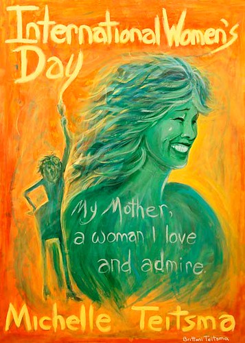
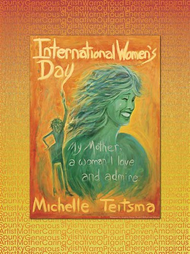
I'm working on a concept for a poster for International Women's Day. In it, I'm aiming to paint something that represents my mother and her influence in my life as an artist.
I started off with a few thumbnails, and almost immediately found something to use towards a rough draft.
I wanted something much more visual than simply telling a story with a text wall. I looked to some of Al Parker's advertisement type work for inspiration and found this:
My layout will be similar, but I aim to make the "paint globs" and the text have some kind of harmony together, rather than blocking everything in it's own separate place.
After leaving this for a short time, I returned to it with a fresh mind and fresh inspiration. I evolved the thumbnails and decided on a look and theme; Retro!
I also explored colour schemes. In keeping with the retro look, I want to stick with a complimentary color scheme. I am leaning toward one that is dominantly Orange, since that is my Mother's favorite color.
I've got the general idea drawn out on large paper here. I still need to place my typographical elements in. I worked out the placement on the bigger board with a small sketch to see what would look most visually pleasing before tracing my art onto the masonite.
After that, I started with a single colour wash on the whole board.
Rather than worry about details right away, I tried to focus on bigger elements first. The whole face got color, then I went in and worked out the d=features before moving onto hair and the silhouette of the body.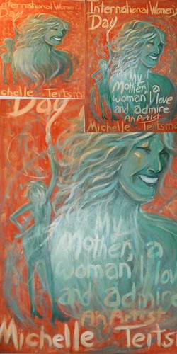 I continued to play with this painting, especially with the highlights in her hair. I feel like I need to be bolder with my colour values, so I am not yet done with this yet.
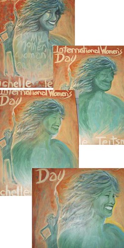
I started off with a few thumbnails, and almost immediately found something to use towards a rough draft.
I wanted something much more visual than simply telling a story with a text wall. I looked to some of Al Parker's advertisement type work for inspiration and found this:
My layout will be similar, but I aim to make the "paint globs" and the text have some kind of harmony together, rather than blocking everything in it's own separate place.
After leaving this for a short time, I returned to it with a fresh mind and fresh inspiration. I evolved the thumbnails and decided on a look and theme; Retro!
I've got the general idea drawn out on large paper here. I still need to place my typographical elements in. I worked out the placement on the bigger board with a small sketch to see what would look most visually pleasing before tracing my art onto the masonite.
After that, I started with a single colour wash on the whole board.
Rather than worry about details right away, I tried to focus on bigger elements first. The whole face got color, then I went in and worked out the d=features before moving onto hair and the silhouette of the body.
 I continued to play with this painting, especially with the highlights in her hair. I feel like I need to be bolder with my colour values, so I am not yet done with this yet.
Okay, so I almost destroyed my mother. No, not my real mother; Painted Mother. I was trying to fix her face and disaster struck. I made it worse the more I tried to fix her, but ended up making more mistakes. There was a point where my paintbrush went flying across the room and I cried "Sweet Mercy, I killed Mom!"

After calming down, I managed to fix it up and it turned out even better. I went out and took high res photos of it so I could pop it into Photoshop and do some colour fiddling.

There! It is now complete! My poster for Women's Day!

Thursday 12 January 2012
Illustration Friday - Week 1
I have started a 14 week creative challenge! To conceptualize and create a finished character design in an promotional artwork, once a week based on Illustration Friday, found here:
http://www.illustrationfriday.com/
Week 1's keyword is... Grounded.
THUMBNAILS & INSPIRATION
I started off by sketching everything that the word brought to mind. It didn't matter if it was relavent or not, I just had to get the pencil moving. Eventually, based on one of many meanings of grounded ie; kid in trouble, I came up with two characters.
Now that I had a fairly solid idea of what the characters look and attitude is, I needed to think of a way to set them nicely in a composition.
I was told of an artist named Sheilah Beckett, and after browsing through some of her work, I found there was a few pieces that really spoke to me compositionally. I loved how some of her work had separate elements linked together in a way it became one solid element.
One specifically drew my attention.
The colours are beautiful, and she brings elements of an environment to help establish the characters surroundings without use of a full background. The grass and flowers become part of the girl and establish a setting.
So now I'm moving on to make a few rough sketches to try and emulate this kind of set up in my own work.
ROUGH WORK
So after the thumbnails were done, I started exploring different ways to illustrate the characters in a way that represents their attitude and the theme.
I drew out numerous different concepts, and this is what I ended up with.
I decided to go with the first one I did, since it best represented the Grounded theme, and I really feel it had the best 'movement' out of all of them.
Now that I fleshed out so many ideas, I am ready to move on and make the final copy.
FINAL STEP
I took my chosen rough draft and cleaned it up, and lined in Photoshop. From there, I created new layers as I added colour and effects.
Once it was all colored, I used a pattern and gradient effect on the final merge to give it a smooth and comic like look and feel.
Then I cleaned up and finished the "base" that the two characters are standing on, created a title and border, and voila! "Volume "1 of the Illustration Friday Challenge!
Subscribe to:
Posts (Atom)


