Tuesday 28 February 2012

Illustration Friday - Week 7 - Capable

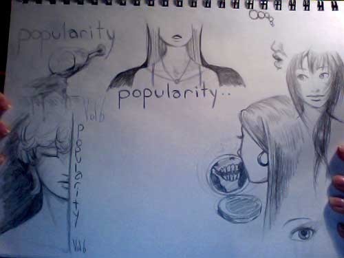
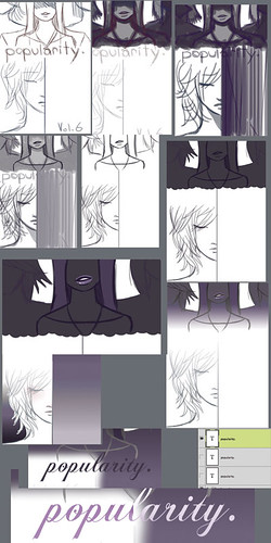
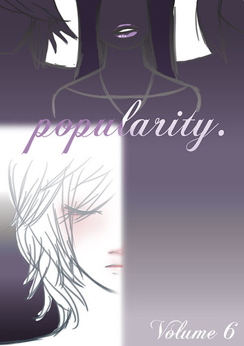
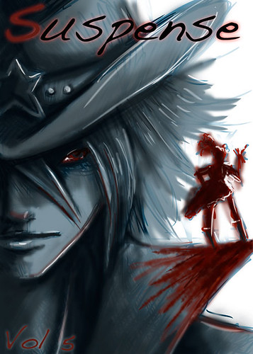
For this one, it took some pondering. I was finally able to come up with a theme after listening to some fast paced rock tunes. This week? A capable fighter! An action piece!

For my inspiration, I stumbled upon a lovely painting by Roy Cross.

Cross09

Technique aside, what also makes this painting amazing is the layout. One thing I noticed was the background took a rule from good photography; the quarter rule. If you have the sky and sea in the same picture, make one or the other 75% of the frame, never 50%. It just looks more dynamic. You can't have equal emphasis in a picture. Something needs to take the most space, otherwise it is uninteresting.

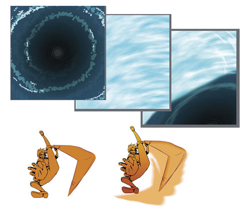
So, I fired up Photoshop and picked up some action poses from a google search to use as a starting point. After that, I began my own gesture drawings to get an idea of what I wanted the main character doing.

capableprogress1

I chose a pose I thought had potential and began to tinker with it. Make it better. Stronger.

ROUGHS

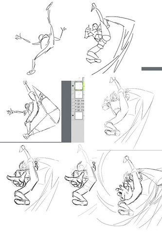
And oh was there a lot of tinkering. Fixing this and that, and going back and fixing something else. Finally, I have a rough sketch I can work off of.

ROUGHs2

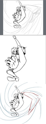
Now the sketch is cleaned up. Time for color.

finalsroughs CapableFinal

Sunday 26 February 2012

Spring Break

What I love about reading week is having the time to draw for my friends. I recently did a whole bunch of quick sketches for my friends of their role-play characters for fun. I felt I needed to share.

DoodleDump1

Saturday 25 February 2012

Designs worth browsing

Sometimes I love to browse the work of others to make myself feel inadequate as a designer. Join me!

Here is a link to a site with a lot of amazing designs. Some are better than others, and some make me want to rip my computer in half from creative envy.

Enjoy!

http://www.blog.blastyle.com/

Saturday 18 February 2012

Landlady's Cat - Part 2

The cat strikes yet again. I was trying to get to school, but the cat was following me. He kept tripping me up and rolling on the ground all cute like, nuzzling my leg. The works. I ended up having to carry him back home, and wound up sneezing half of the day cause of my allergies.

He does it on purpose.

cat2

Tuesday 14 February 2012

Illustration Friday - Week 6 - Popularity

Oh boy~ This subject is pretty fun. I'm still in th process of creating a solid concept, but where better to start than checking out the old masters? One of my favorite illustrators, Rowland B Wilson, was my first stop for inspiration. Wilson24 He has a great way of having the figures and text work on the same page; as if they were made for each other. Not to mention his cartoony style is up my alley! So I'm aiming to ultimately have my title and text on the book cover work with the images instead of having them simply slapped on there at the end of the road. SuccessfulThumbnails I had a few pages of failed attempts at ideas for this piece before this miracle page of wonder came about. I liked just about everything about these sketches, so I ended up using elements from two thumbnails into one composition. I decided that this would be an illustration for a young teen novel, since "Popularity" is mostly of the concern and issue of children and teens. Or at least it's one of many big concerns for that age group. I wanted to capture the dark side of the word in my work, and create something rather moody. screenshots_blog6 I knew from the beginning I wanted a simple colour scheme, and dark tones to convey the mood of the book. At first I wanted a sans serif font for the title, but found it didn't quite breathe the right life into the artwork. A simple script really helped portray the girlish nature of the art style, and also the complicated emotions that come with "popularity". Popularity_revise

Saturday 4 February 2012

Illustration Friday 5 - Suspense

This week's word is suspense, and I am looking forward to making a dynamic and fun to look at book cover!

I stumbled upon a wonderful illustration by Thomton Utz that really caught my eye.
I always love extreme closeups, having the face take up most of the canvas is dynamic, but also tricky. While I personally don't much like the interaction between the foreground and background, it's definitely creative and visually effective.
With that, I'm going for a composition that includes an extreme close up and smaller figure to tie it all together.
I tried a few different ways to pull this off to find the best result.
I sketched out a loose framework in blue, and then went in and refined the details, darkest values to lightest. The more I worked and refined, I started to blur out the guidelines I'd done in blue.
In the end, I ended up with a dark, painterly style.

Suspense